"Hala-Hala" Logo


Logo designed for Aerostar, the company that operates and manages Luis Muñoz Marín International Airport in Puerto Rico.


The logo is for a fundraising event featuring a Plane Pull. The name "Hala-Hala" is a play on words. In Spanish, "Hala" means "pull." Additionally, "Hala-Hala" references a genre of Latin music and dance that originated in Puerto Rico in the 1960s, known as Jala-Jala, reflecting its pronunciation in Puerto Rican Spanish. The logo employs a mirroring effect with the words to create abstractions of plane wings and direction using the resulting negative space. One of the words, "Hala," is reversed, but this is not immediately noticeable. The logo is contained in a luggage tag that supports the direction effect and the wing graphics.


Villa Annunziato


Logo for luxury beachfront vacation home rental.


Logo combines the symbolism of the sun and cut diamonds. Constructed from the letters "V" and "A" which are the first letters of the name of the space: Villa Annunziato.


Diseños CÁICU


Logo for permaculture, agroforestry systems & syntropic agriculture organization


Cáicu means island, reef. or land in the Taíno language. Cáicu Designs focuses on the principles of permaculture and syntropy.

Permaculture values care for the land, fair distribution of resources, and care for people. Syntropy is an agriculture technique where natural succession processes, the structure of plants and the great biodiversity are used to create systems for food, wood, water treatment, etc.

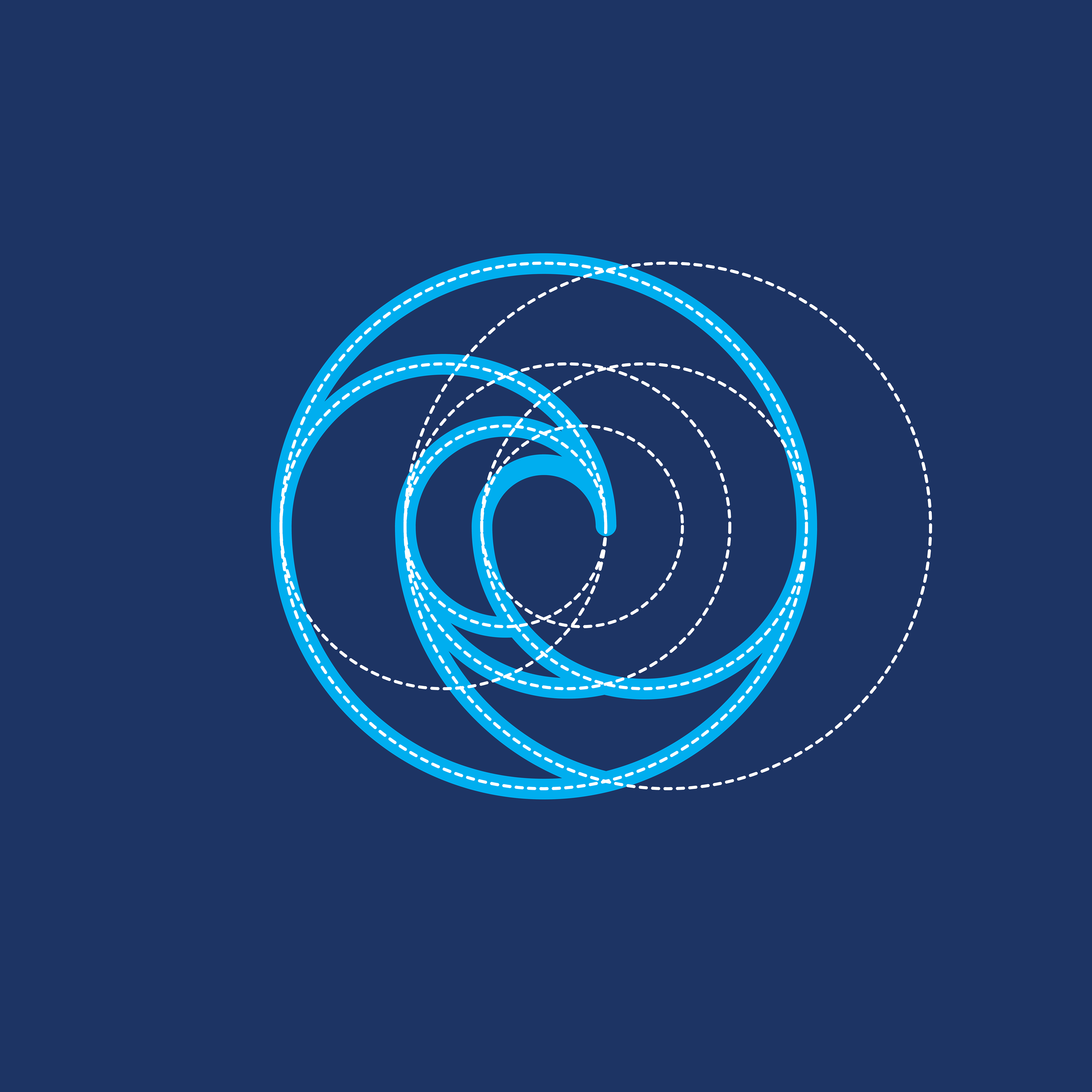
Symbol construction inspired on mathematical ratio of plant growth to represent harmony with, and honoring of it’s natural rhythm.

Plant symbol sits or it’s contained within an irregular border representing land, island, rock, reef.


iclimbpr


Logo for mountain climbing tours company.


Design for mountain climbing tour company @iclimbpr ... Inspired in cams, taíno petroglyph graphic style, and on the complex management of equipment in climbing.


Massage Therapy Hall of Fame


Badge for Massage Therapy Hall of Fame Members at the World Massage Festival.


Design concept as described and understood by client …

The four leaves represent the four corners of Mother Earth with foliage from each corner. The four hands out stretched shows that healers come from all corners of the earth to serve. Being right at N. S. E. W. would leave them standing alone, so they lean into each other for support and lock thumbs to secure the bond. Thus forming the diamond that protects Mother Earth. But if you look from the opposite direction in the hands, you see three candles warming and caressing. 12 candles representing the 12 months... signaling a never ending flame of added protection.


PPR

Collateral graphics for eco-conscious political party.


Plastic Poop

Identity and illustrations for PlasticPoop online shop & apparel brand.


The constipated water planet logo … You could say it’s a dual-purpose logo.

One one side, it represents the Earth globe full of plastic and having trouble with bowel movements (on the lower end). On the other, it is the constipated belly of our illustrated species.The initial inspiration for our logo and this concept, is the fact that baby albatrosses die from plastic fed to them by their parents who mistake floating trash for food.

Other sea animals are also dying; and now plastic is even found in human poop. Plastic Poop’s little illustrations are a way to create awareness about this. It’s just that marine life cannot take laxatives and we can’t pretend that they now learn to differentiate between their food and our crap. Perhaps you’ve seen one of those photos on the web of marine animals with undigested plastic in their stomach. No? Here’s one by Chris Jordan.


Screen+Shot+2019-07-06+at+2.09.02+PM.jpg

Diatom Environmental Services


Identity for environmental consulting company.


Inspired by the diatom, the logo represents the company's dedication to environmental services. The diatom, a microscopic aquatic organism, is symbol of nature's resilience and its crucial role in maintaining a healthy ecosystem. At first glance, the logo features a stylized representation of a diatom, showcasing its intricate and symmetrical structure. The diatom's delicate and graceful form embodies the fragility and interconnectedness of our environment. The lines and curves in the logo create a sense of harmony and balance, reflecting the company's commitment to preserving the delicate equilibrium of our planet.

The diatom's significance goes beyond its aesthetic appeal. As a photosynthetic organism, the diatom is known for its role in absorbing carbon dioxide and releasing oxygen, contributing to the mitigation of climate change. This symbolism aligns with the company's core values of sustainability and environmental stewardship. The logo incorporates a vibrant color palette inspired by the natural world. The colors used evoke a sense of tranquility and the vitality of our planet's ecosystems. They are carefully chosen to convey a feeling of environmental consciousness, reminding viewers of the importance of protecting and preserving our natural resources.

The overall design of the logo exudes a sense of professionalism and reliability. Constructed using golden ratio proportions, the clean lines and attention to detail communicate the company's commitment to delivering high-quality environmental services. Additionally, the logo's simplicity ensures versatility, allowing it to be easily recognizable and adaptable across various mediums, from digital platforms to print materials.


Center for Taiji & Qigong Studies


Identity for Taiji & Qigong training center.


Logo incorporates recognizable elements of ying/yang symbol as well as represent internal inside-out movement capturing the essence of truth surfacing from disciplined practice. The 3 inner circles arise from such movement and each contains a character of Qui Zen Yi.


Kennis School of Allied Health

Identity for post-secondary allied health school.


Design for allied health school logo. Symbol represents the function of synapses which are the connections through which brain neurons communicate with each other. Synapses are able to control the strength of the signals transmitted between neurons, and synaptic strength changes according to the stimuli received during a learning process. Constructed using golden ratio proportions.